Title Sequence Time
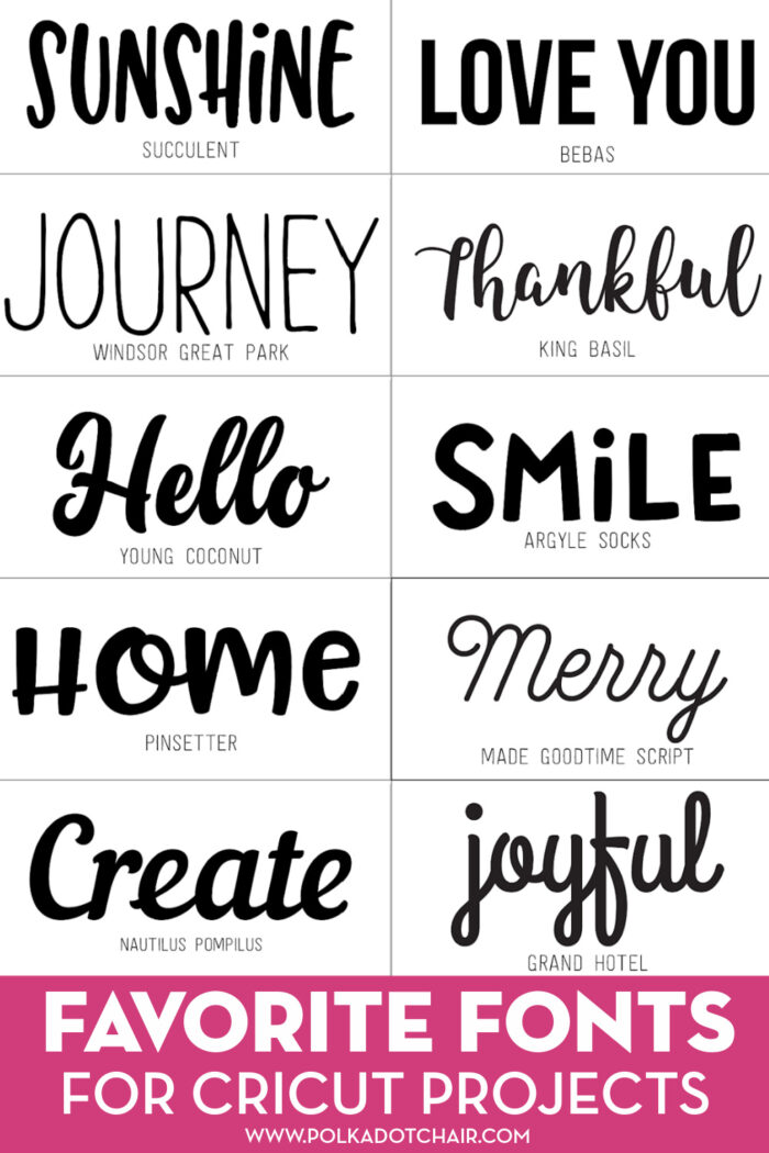
Today we filmed, edited and finished our title sequence. This was a lot harder than I had expected it to be. It was one of the last things we had to do. We had pretty much everything else done. All we really had left was to fix a few things from our clips. About halfway into filming, we realized that the title sequence had to be shorter than we had previously thought. This was a minor setback. We had a lot of fun putting everything together though. W experimented with different fonts, and different timings for the titles to pop up. We also had a few editing changes throughout the process. Mostly, we got creative with how and when the titles would appear on screen. At first we tried making the titles sort of fade into place, but we didn't like how that looked. After that we tried to add some variety, and we liked it a lot more. Some of our titles spin or just pop onto the screen. My personal favorites were the ones that flew in. These were all vey fun to experiment with and put together. However, we realized that this style of titles did not really fit our genre. So we decided not to use the really funky ones, and kept it more simple. After we were sure we finished we watched it. It turned out really good! 
Comments
Post a Comment